Aerial imagery for solar rooftop design
Aurora's aerial imagery feature lets solar designers pull provider imagery directly into their 3D modeling workflow. I owned this feature for over a year across four releases, inheriting a design system transition mid-flight and shipping iteratively under real engineering and business constraints. The work grew from a basic reskin into a full UX unification project through resolving accumulated interaction debt across five imagery providers, cleaning up a fragmented component system, and establishing new design system guidelines for readability and edge case handling.
The evolution of this feature was core to the company's value proposition, providing data to 3D model a project site without needing to physically be there. When this feature launched in Europe, the release unlocked over 14 new European customers and more than $1.5M in revenue.
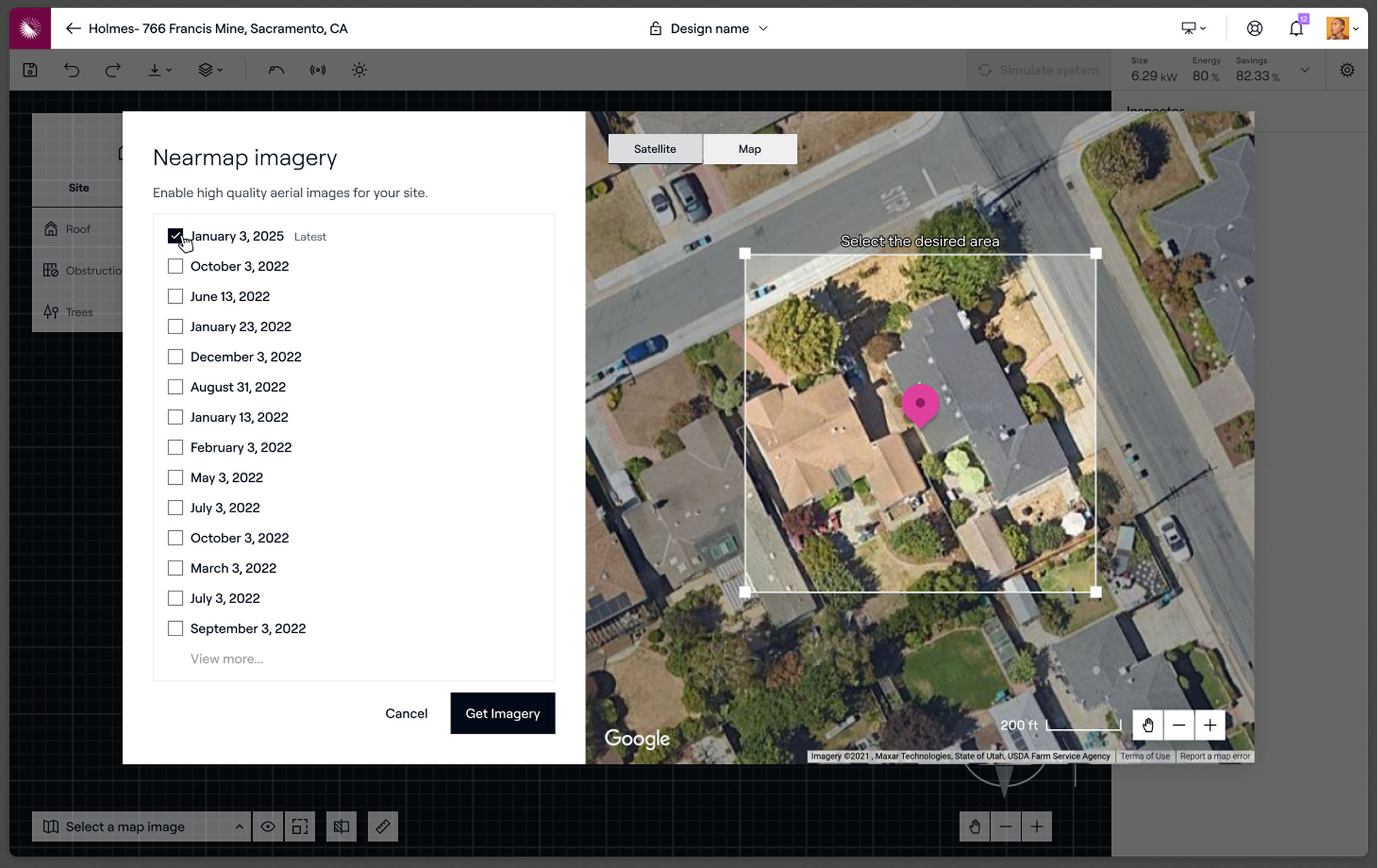
The final release unified what had become three divergent modal permutations into a single coherent experience.
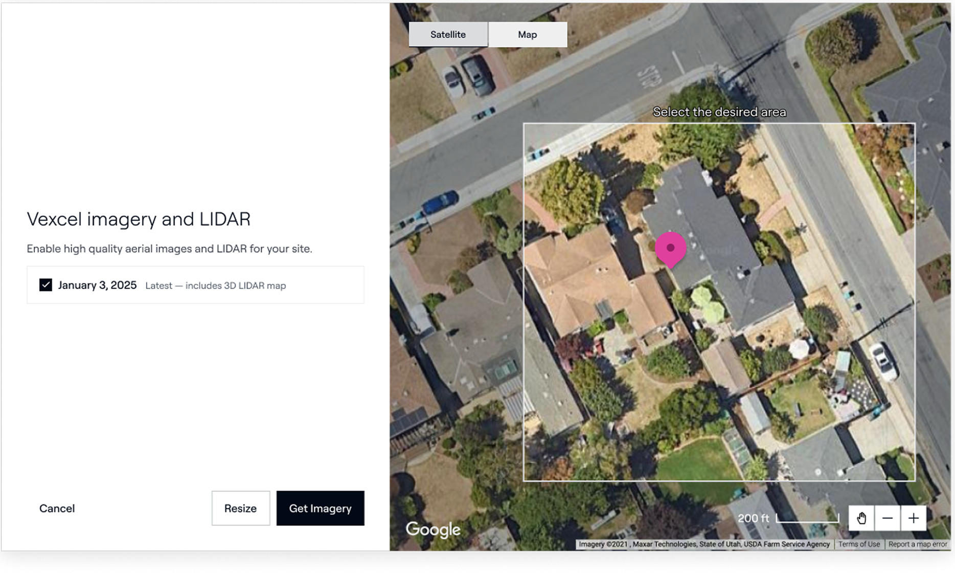
Aurora's 3D modeling product depends on aerial imagery. Solar designers need accurate overhead views of project sites to create precise, installable designs. The platform supported imagery from multiple providers: Google, Bing, Nearmap, Vexcel, and EagleView. Each provider has different resolutions, different geographic availability, and some offering 3D data paired with the imagery useful for accurate roof modeling.
Managing that provider diversity from a UX perspective was the core challenge. Each provider had different constraints. Site availability varied by geography. Some providers offered data types others didn't. The feature needed to present a simple, consistent experience to the user regardless of which combination of providers was available for a given project site.
Over a year of iterative releases, that consistency proved difficult to maintain under real shipping pressure.
I owned the aerial imagery feature across its full year of active development, responsible for design from the initial design system transition through to the final UX unification. This meant inheriting prior decisions, shipping under engineering constraints, and making deliberate calls about when to take on UX debt and when to pay it back.
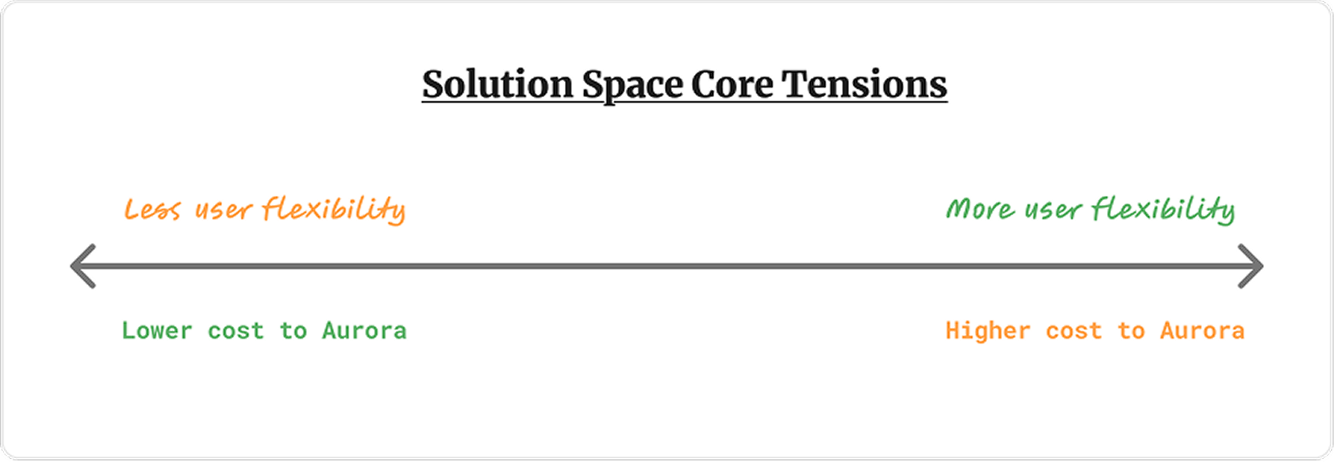
The central design problem: how do you create a coherent, simple imagery selection experience when the underlying providers are inconsistent and largely outside your control?
The feature had additional complexity from a business model shift. Aurora moved to a credit-based pricing model during this period, with imagery costs wrapped into a per-project credit cost passed to customers. This changed how the feature needed to frame imagery selection without surfacing pricing complexity directly in the workflow.
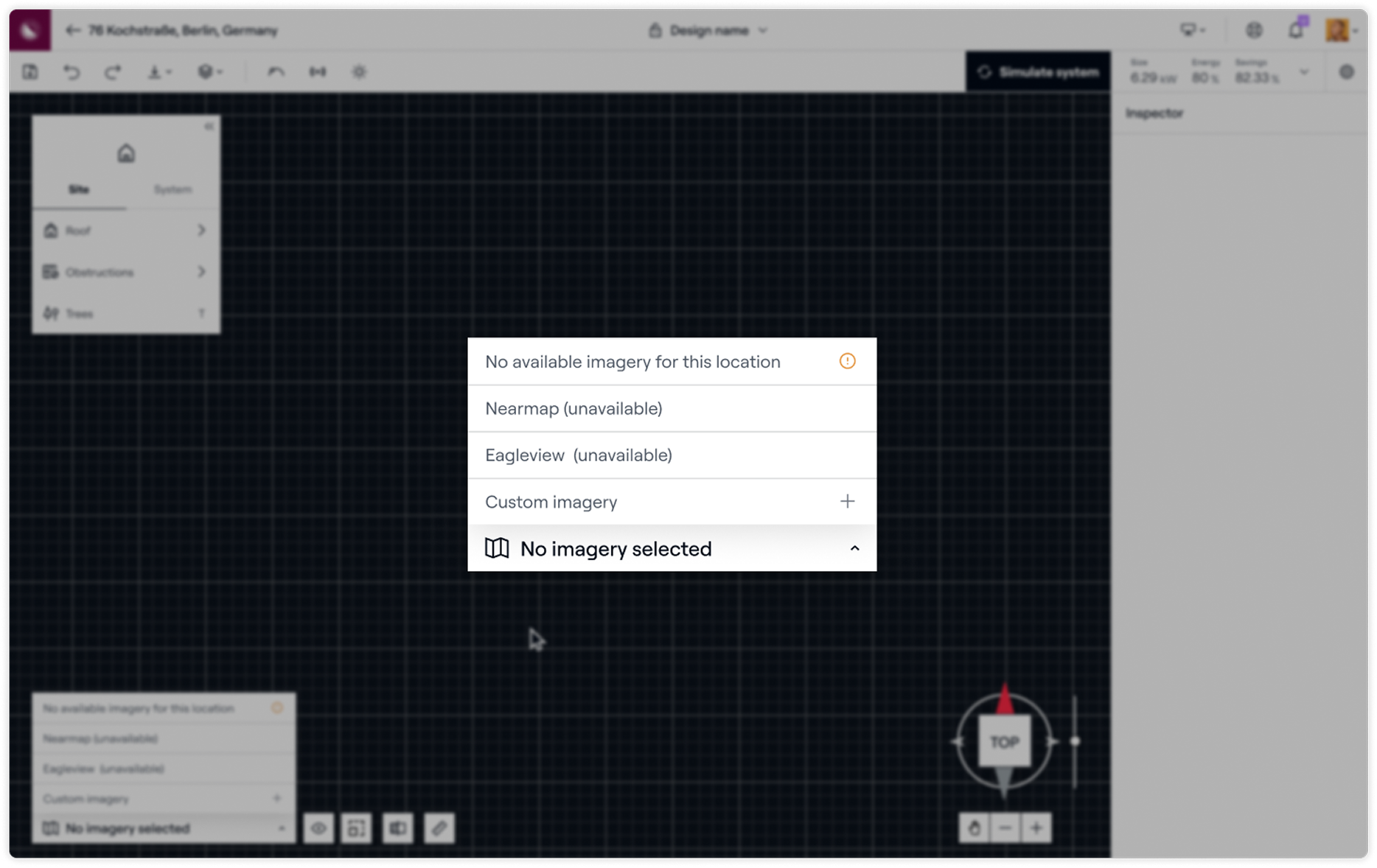
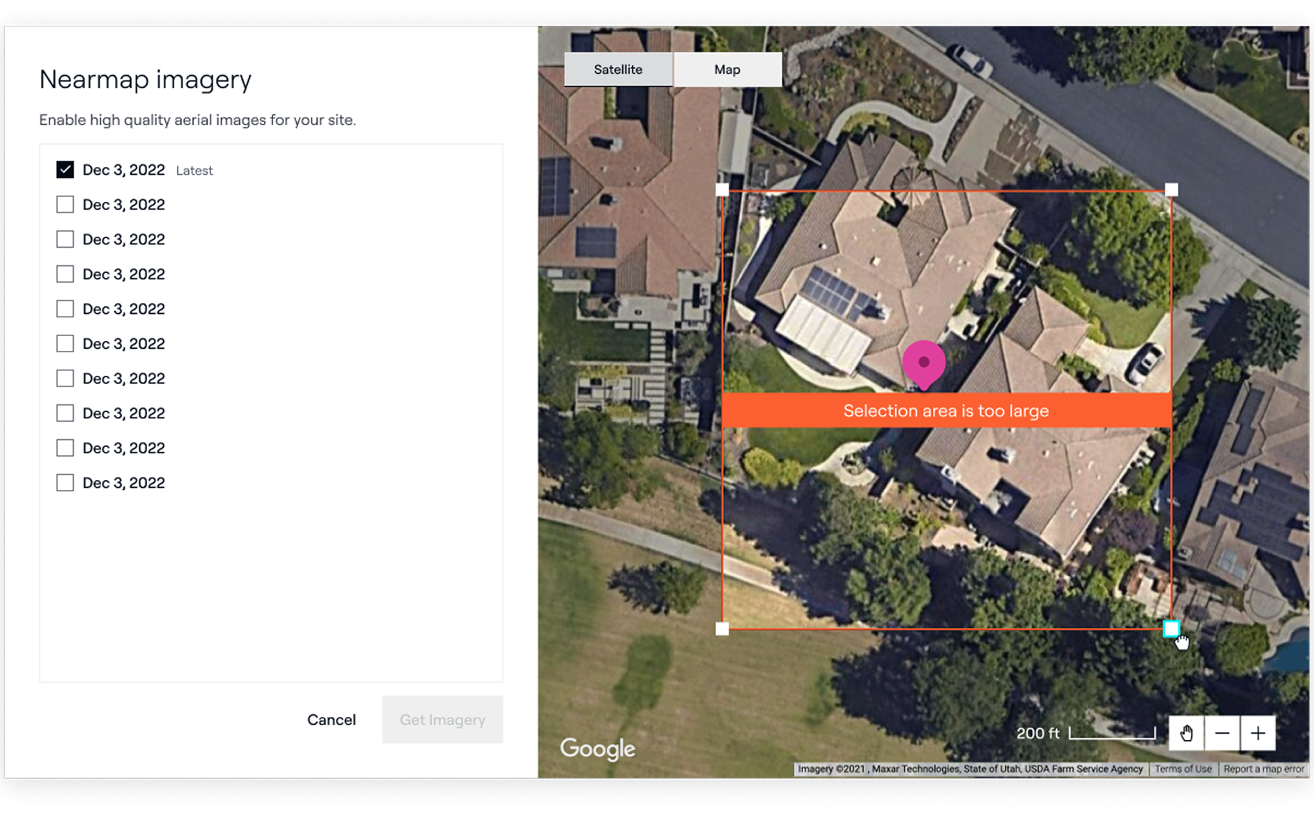
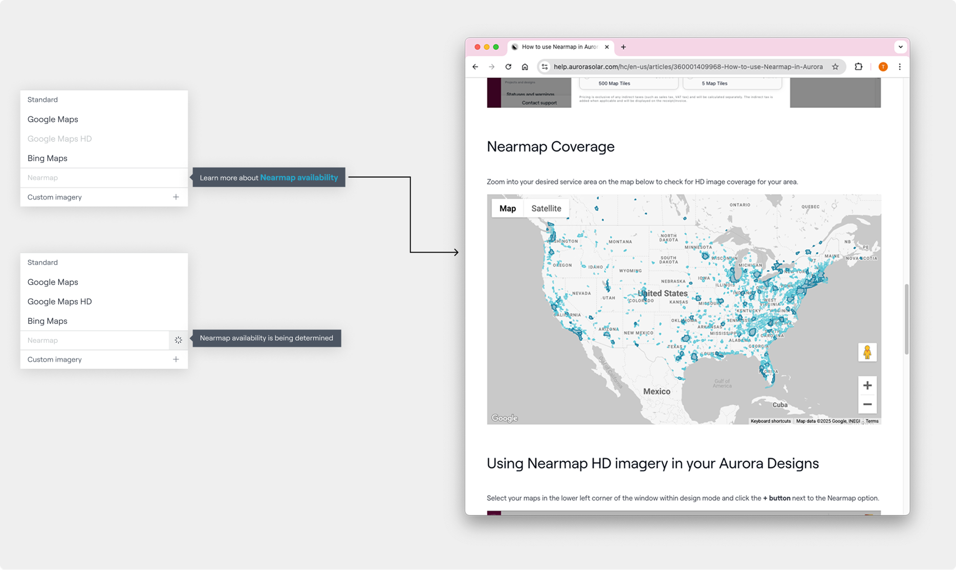
The UX also needed to handle a range of edge cases that became more acute as provider coverage expanded: what happens when a user selects an area too large for a single download, when imagery is available from multiple dates and needs to be displayed simultaneously, or when a provider simply has no coverage for a given site.
Release 1: Design System Transition
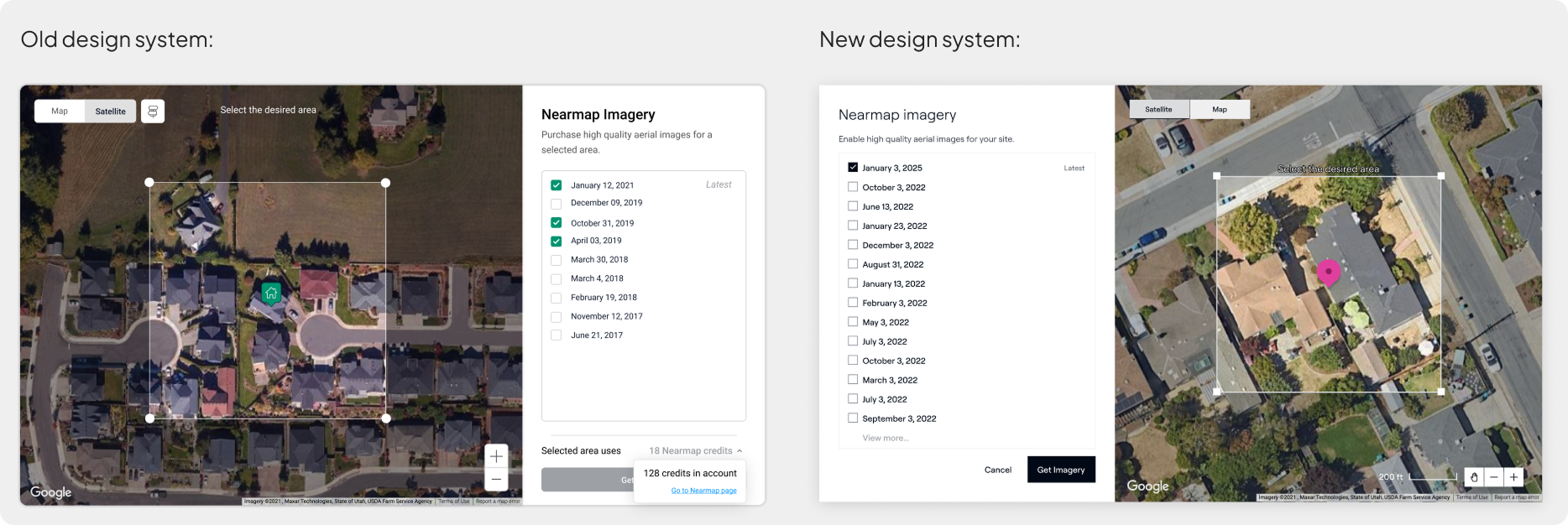
The first release was a deliberate reskin — migrating the existing feature from a previous design system to Aurora's new one. This wasn't purely cosmetic work. The transition created an opportunity to address accumulated UX debt in the existing implementation: broken error states, inconsistent hover and pressed states on interactive objects like selection handles, and visual inconsistencies across the feature's multiple states depending on site imagery availability.
Getting the foundation right here mattered. The feature was going to grow, and a cleaner base would make subsequent releases easier to build on.
Release 2: International Imagery Provider
The second release added an international imagery provider to unlock Aurora's European market, where the existing US-based providers had no coverage. The engineering reality was that this provider needed to ship fast. The pragmatic decision was to build it using a separate modal rather than integrating it into the existing selection flow.
This was a deliberate short-term tradeoff. Getting the feature into users' hands in Europe was the priority. The cost was a second permutation of the modal — a fork in the UX that would need to be resolved later.
The release unlocked over 14 new European customers and more than $1.5M in revenue.
Release 3: Third Provider, Third Permutation
A third imagery provider was added in the next release. Following the same pattern as release two, it shipped with its own modal variation. By this point the feature had three divergent implementations of what was nominally the same UX, each with slightly different interaction patterns, component states, and visual treatments.
The feature worked. But the debt was visible, and it was accumulating.
Release 4: Unification
The fourth release was the one I'd been building toward. With the major provider integrations shipped and validated, the priority shifted to resolving everything that had accrued across the previous three releases.
The work covered several layers. I unified the three modal permutations into a single coherent interface capable of handling all provider combinations and site availability states.
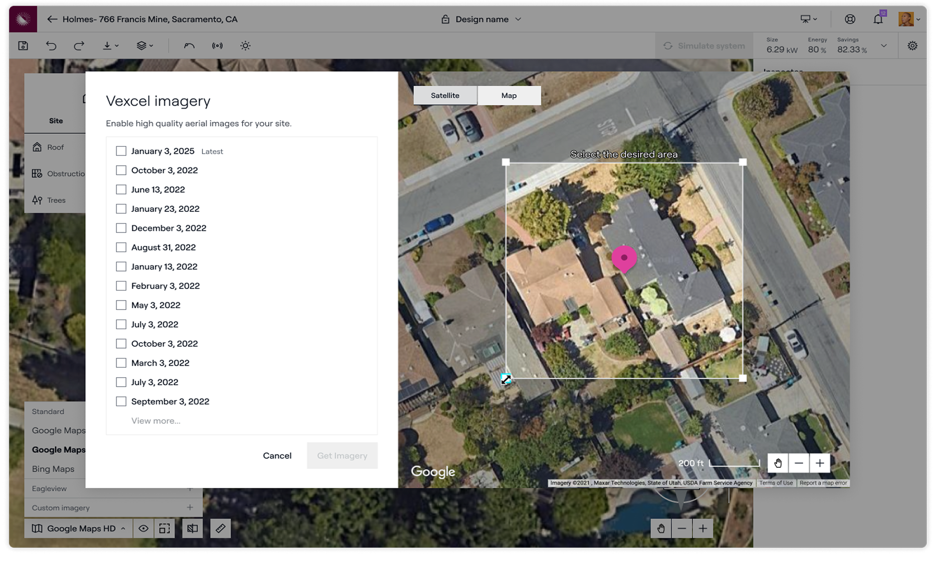
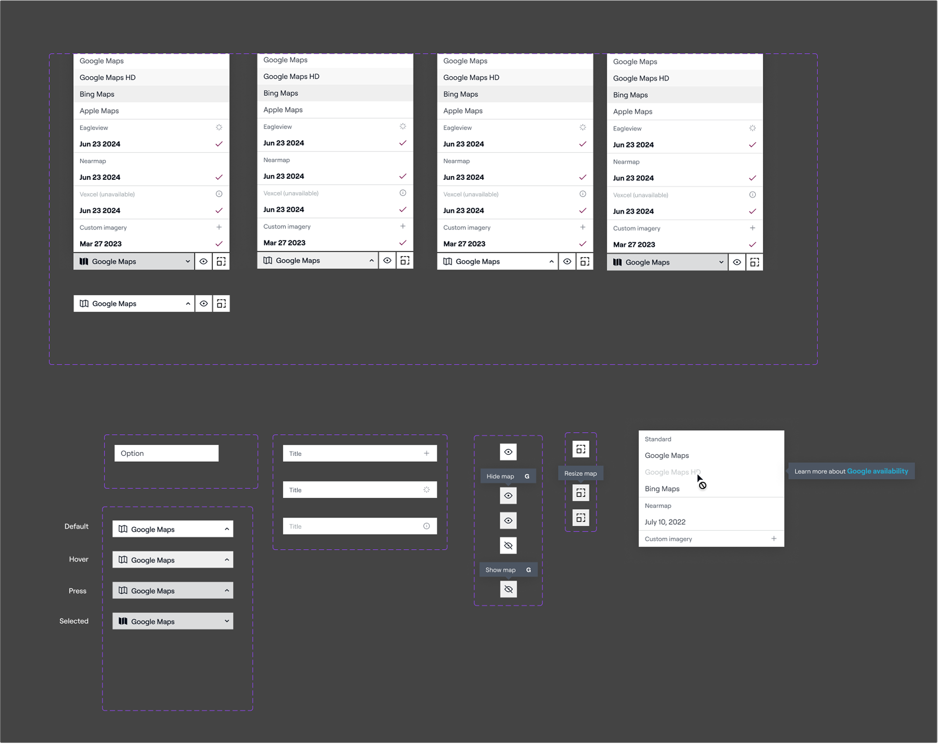
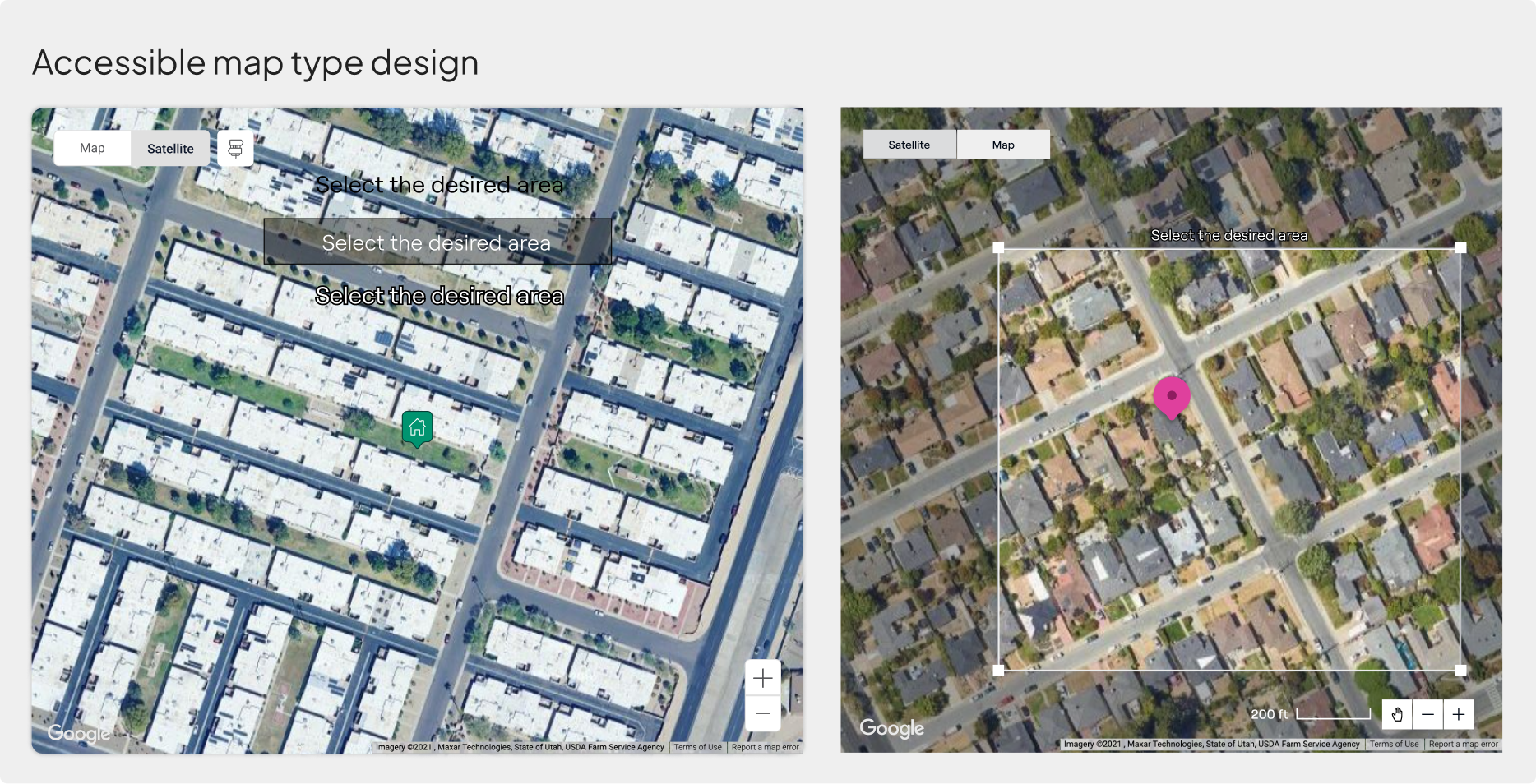
I cleaned up the feature's component system and standardized interactive object states including all state treatments for selection handles and controls, matching the design standards that existed in the broader 3D modeling suite. I established design system guidelines for type legibility over map imagery, solving for labels and UI elements getting lost against varied satellite backgrounds. And I designed a complete set of error states covering the edge cases the feature needed to handle: oversized selection areas, multi-date imagery display, and provider unavailability by geography.
The result was a feature that felt like it had been designed as a whole rather than assembled in pieces.
The modal fragmentation across releases two and three was a known tradeoff at the time, not an oversight. But in retrospect I would have pushed harder earlier for a more provider-agnostic interface architecture — one designed from the start to accommodate new providers without forking the UX. The unification work in release four would have been significantly lighter if the abstractions had been cleaner from release two onward. Shipping fast and paying down debt is a real and sometimes correct tradeoff. But the design foundation shapes how much debt accumulates, and I'd invest more in that foundation earlier.